|
Good typography is just as important on a web page as it is in any other medium. The fact that it appears on a computer screen and not on a piece of paper is immaterial, it should still be pleasing to look at and easy to read. In every situation where type is used - in publishing, signage, packaging, television etc. - the designer has to adapt his techniques to suit the medium. A headline style that works just fine in a magazine spread would not necessarily work on a poster. A magazine is always viewed straight-on at arms length so letter spacing can be as tight as you like and the words will still be readable. A poster is, more often than not, viewed obliquely, which distorts the type to some extent. Here, a little extra letter spacing helps identification of the individual characters, and hence the words. Designing for a computer screen has its own set of problems. Add to these the elastic nature of a web page, which has to work across different computer platforms and screen sizes, and the problems get even worse. It is the designer's job to understand these issues and to address them - to maintain some kind of control when everything else is shifting. |
Ninety percent of web
pages that
The traditional techniques of using 'Colour', in typography, refers to the perceived typographic 'colour' are not very useful in relative greyness of black and white type. web page layouts because of the On a web page, you can of course use real colour lack of fonts and type weights available to achieve similar separation and contrast. and the fact that some sizes of the Use colour to create a hierarchy of prominence type that is available can look very ugly
|
The first problem is that the line lengths get too long. In print, there is a relationship between the length of a line and the 'leading' - the space between lines. If the line is too long, and the leading too tight, it is difficult to read from the end of one line to the beginning of the next - lines will be read twice - or skipped. A typist can use one and a half or double spacing to alleviate this problem, but a web page designer has no such luxury. There is no concept of 'leading' in HTML as yet. You can't easily control the space between lines, but you can make sure that they don't get too long. Restricting line widths using the BlockQuote feature to give wider left hand margins will help, as will the use of the 'Tables' function to split text into narrower columns. The other way to regain control is to dispense with the default 'soft' word wrap feature and put in 'hard' <BR> (break) characters where you want a carriage return. This allows you to keep lines short - and to control the typographic shape of the right-ragged edge. One way to simulate leading is to insert spaces of a larger type size into lines of text using the <FONT SIZE=+1> </FONT> tags. To keep things tidy, this is best done at the end of the line before a <BR> tag. The 'SIZE=+1' can of course be increased as required. The HTML specifications allow for a hierarchy of headline sizes. These sizes are relative rather than absolute and are displayed in a bold typeface. They do tend to be rather ugly though. Here, an important distinction must be drawn. There are typefaces which are designed especially for the screen and those that are produced by calculations from a basic font description. |
Note how the screen
fonts are more
|
With a 'screen font', the type designer has considered each individual character at a pixel level and optimised the character shapes to work within the constraints of a grid. Fonts will be designed in a range of specific font sizes 8, 9, 10, 12, 14 etc. Specifying a size that is not a 'designed' font size ie. 11 or 13 point, will generate a 'calculated' font which visually approximates the chosen size but loses all the design's subtleties. In producing a screen version of a traditional printer font, like Helvetica or Times, the designer has to keep as true as possible to the original design at the expense of 'screen sympathy'. |
Italic fonts fight against the
constraints |
Bold fonts are often calculated fonts based on an algorithm that adds extra pixels around the edge of a 'designed' roman font. When you get the combination of an 'undesigned' font size and the 'bolding' algorithm, that's when things start to get nasty and is, unfortunately, what you have to put up with in web page typography. It's not just the character shapes that suffer, the tracking and kerning goes too. Italic fonts are best avoided. They are completely at odds with the constraints of a square pixel grid and will almost always look awful, especially at small sizes. Many people use graphics for headlines. These can be created in PhotoShop or other graphics packages, saved as GIF files and will generally look better than the indigenous type and give a lot more scope for individuality. They do take longer to download though, and there is the possibility that the user has switched off, or can't display, graphics. It is especially important to make use of the 'ALT' tag for graphics that contain text so that the headline message is not lost altogether. |
H T M L L
E T T E R S P A C I N G
|
Typographic tricks like letter spacing are a little more difficult to achieve in HTML as it only allows one space between any two characters. You can letter space a word by inserting a discrete space between individual characters, but when it comes to word spacing, you get stuck because you need two or more. By using the non-breaking space character ' ' you can force extra spaces between characters or words. To force extra space between lines, use alternate <BR> and <P> tags. |
This HTML rule clearly
doesn't work
Rules created in
Photoshop |
HTML supports horizontal rules which can be used to separate blocks of text on a web page. In traditional typography, the use of rules is often frowned upon by purists. HTML rules are functional rather than stylistic elements although, occasionally they will be used for 'decorative' purposes to liven-up a bland layout. Be aware that each browser treats rules in its own way. NetScape assumes that you are using its default grey background and puts in a 3D rule that won't necessarily look right on other colours. You can, of course, insert a graphic as a rule. It won't have much of an overhead in loading time because it will compress very efficiently if it is a single colour and you can adjust its width from HTML by adjusting the IMG SRC 'Width' factor. It will not, however, adjust its width dynamically when the browser window is resized as the <HR> tag does. |
|
To form an upper case character takes a minimum of seven pixel in height. Because of their ascenders and descenders, it takes nine pixels in height to render a lower case character. So you can have a seven pixel high screen font if it has only capitals, but a normal font, with upper and lower case characters, requires nine pixels. |
Comparison of
perceived
|
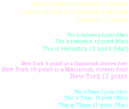
On a Macintosh computer screen, there is a direct correlation between pixel height and point size - a nine pixel high font is effectively a nine point typeface. The Macintosh screen works on the basis that there are 72 pixel per inch, so each pixel is one point square. You can try holding a ruler up to the screen and comparing the measurements with the rulers in an application - they will be approximately the same. Note that with the introduction of multi-scan monitors, this principle is no longer always valid. Changing screen resolution from 640 x 480 on a 14" monitor to 800 x 600 on the same monitor makes the pixels correspondingly smaller, and the inch or centimetre on the application ruler smaller too. PC fonts are different because they dispense with the WYSIWYG concept of an inch on the screen measuring one inch. Measure an inch on the ruler of a PC application, and it will be 96/72 or 1.3 inches approximately. This is because Windows considers an inch to be 96 pixels. On a 14" 640 x 480 VGA monitor, the individual pixels can not be smaller, so the inches have to be bigger. The effect that this has is that PC type sizes are specified as being about three quarters of those on a Macintosh. A 9 point PC font is physically the same size as a 12 point Mac font measured on their screens. A 14" PC screen running at 800 x 600 does have physically smaller pixels and so its 'logical' or 'virtual' inch is closer in size to a real one. The outcome of this is that type specified as 7 or 8 point on a PC can be fully formed whereas the smallest Mac font will be called 9 point. They are effectively the same size on the screen at the same resolution. It is only when they are printed out that the PC font will be reduced to its correct 8 point height and the Mac font, 9 points. |
SANS SERIF FACE BOLD SANS SERIF You can specify a sans serif typeface
SERIF FACE BOLD SERIF You can specify a serif typeface
ARIAL BLACK (if installed) PALATINO (if installed) You can specify exotic typefaces
|
Some browsers now support the <FONT FACE> tag which lets you specify a typeface for use on your page. You have to realise that readers will not necessarily have any typeface that you specify installed on his or her computer so you should use ones that are installed by default on the computer. A comma-separated list of fonts can be placed after the FACE tag and the browser will use the first one it comes to in the list that is installed. If none of the faces in the list are available, it reverts to the default. Mac and PC users will have different fonts installed so, the very minimum list of fonts should contain the Mac and PC equivalents. If you want to specify more exotic faces, put them first in the list followed by near equivalents and finally, the safest one shown opposite. When I say 'exotic', I simply mean fonts that are not installed by default and may not be available to some readers. MsIE installs a set of Microsoft fonts on the Mac that have direct equivalents in Windows, but Netscape users won't have them. Many popular PC programs install additional TrueType fonts but Mac users and PC users who haven't bought that particular package will not have the benefit. Macs come with a very basic set of fonts, shown opposite. Although Mac users may have many more fonts installed, they will all be different and you can't, and shouldn't count on fonts other than these being available. If your site is aimed primarily at PC users, you can safely specify any font from the Windows set first and put a Mac substitute second and vice versa. If your site is for general consumption it is best to stick to the safe set. If you really must have a particular font for a headline, consider using a bit-mapped, anti-aliased font. A single colour font with an anti-aliased edge can be saved as a 4-bit GIF which is very compact in file size. Of course, the reader may have graphics switched off, so remember to give the GIF an <ALT> tag to show what the headline would say.
|

This layout has a
'Hard' left hand
|
There is another factor to consider. PC users have, depending on their monitor resolution, the option of using 'Large' or 'Small' fonts. The 'Large' fonts option compensates for the fact that type can get too small to read comfortably on higher resolution monitors. So, the size of type relative to an adjacent graphic can be radically different from one PC to another. In 'hard' layouts, it is important to check this difference and the effect that it has on your design. The trick here is to mix 'hard' and 'soft' elements within your page, using the 'soft' ones to take up the slack between the more controlled ones. Don't be afraid to use space creatively, it is particularly elastic. |